Your home doesn’t need a full renovation to feel fresh, intentional, and very “right now.” Modern interiors are less about matching sets and more about creating spaces that feel lived-in, flexible, and quietly bold. Think: fewer rules, more rhythm. Less “showroom,” more “this is exactly how I like to live.”
Below, five innovative home living ideas that tap into current design energy without feeling like trends you’ll regret in a year.
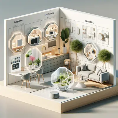
1. The Soft-Shift Flex Room
The old idea of a “formal” room is fading. Today’s homes work hardest when one space can do multiple jobs without looking like a chaotic mashup.
Start by choosing one anchor function—like lounging, dining, or working—and design around that. Then layer in a second role that can appear or disappear when needed: a slim console that converts to a desk, nesting tables that slide out for group dinners, or a bench with hidden storage that doubles as extra seating when friends drop by.
Use a consistent color story so the room still feels calm, even when it’s in “multi-task mode.” A neutral base (creams, beiges, soft grays) with one or two accent shades lets you move pieces around without visual noise.
Lighting is your secret weapon here. A floor lamp with dimming options, plug-in sconces, or a smart bulb in a simple pendant can let the same room shift from laptop zone to wine-night glow in seconds. The goal: a space flexible enough to change daily, but styled enough that it never looks “temporary.”
2. Mood Layering With Texture, Not Clutter
Instead of buying more decor, think in terms of texture. When you walk into a beautifully styled home, what you usually respond to isn’t “more stuff,” it’s contrast—smooth against nubby, cool against warm, matte against glossy.
Layer textures strategically: a boucle or wool blend on the sofa, a linen throw, a jute or sisal rug, a single ceramic piece with a chalky finish on the coffee table. This creates depth without needing a lot of objects. In smaller spaces, this approach feels luxe but not crowded.
Avoid over-styling every surface. Leave pockets of visual breathing room: an empty patch on the bookshelf, a clean corner on the kitchen counter, a nightstand with just a lamp and one book. The eye needs rest for a room to feel elevated.
Textural balance is also about temperature. Pair warm-toned woods with cooler stone or metal. Put a polished side table next to a soft, slouchy armchair. That mix is what makes a space feel curated rather than catalog-perfect.
3. Gallery Corners Instead of Gallery Walls
Huge gallery walls had their moment; the fresher move now is the intentional “gallery corner.” It’s less commitment, more character, and way easier to update.
Choose a corner that naturally draws the eye—by a window, behind a reading chair, or at the end of a hallway. Instead of filling an entire wall, cluster 3–5 pieces: a framed print, a small sculptural object on a pedestal or stack of books, maybe one leaning piece instead of hung.
Play with height: hang one piece higher than you think you should, lean another at eye level, place a plant on a low stool to soften the lines. This vertical layering keeps the area from feeling flat.
Think beyond traditional art. A beautiful textile you picked up while traveling, an oversized photo from your camera roll printed on matte paper, or a simple line drawing can all become focal points. Rotate pieces seasonally so the corner always feels alive. It’s a low-lift way to keep your home in conversation with your current mood.
4. “Micro Zones” for Everyday Rituals
Design isn’t just about how your home looks—it’s about how it supports the rhythms of your life. Micro zones are small, ultra-specific setups that turn daily habits into rituals.
A coffee ritual zone might be a tray with your mugs, beans in a glass jar, a tiny vase, and a spoon rest, all grouped together on the counter or a bar cart. A wind-down nook could be a chair by a window, a soft throw, a small side table, and a lamp at warm color temperature with a dedicated stack of books.
The key is intention and containment. Use trays, baskets, and small side tables to visually “frame” each micro zone so it reads as deliberate, not like clutter that landed there by accident. Stick to one color family or material (all light wood, all black metal, or all clear glass) to keep it cohesive.
These micro zones don’t need a ton of square footage. A single cleared shelf in the bathroom with a candle, a small dish for jewelry, and matching containers for skincare can turn a basic space into a mini retreat. When your rituals look inviting, you’re more likely to actually use them.
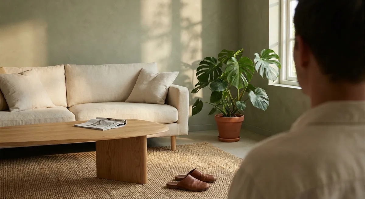
5. Natural Light as the Main Design Feature
Instead of asking, “What should I put here?” start with, “Where does the light move?” Treat daylight as your primary design element and build around it.
Watch how sunlight travels through your space over a day. Place reading chairs where the light is soft, not glaring. Move your dining table closer to a window if possible—meals instantly feel more elevated. If your home is low on natural light, focus on amplifying what you do have: sheer curtains instead of heavy drapes, mirrors placed opposite windows, light-reflective paint finishes in key zones.
Layer artificial lighting to complement that natural rhythm. Use warm, diffuse light in relaxation zones (bedroom, lounge areas) and neutral, brighter light in task zones (kitchen, desk). Avoid the all-over “big light only” habit; it flattens a space and kills mood.
Keeping window treatments simple—linen sheers, solar shades, or minimal hardware—lets the architecture and light stand out as their own design statement. When you treat light like a material, your space starts to feel more intentional, even if you change nothing else.
Conclusion
A modern home doesn’t have to scream for attention. The most compelling spaces right now are quietly confident: flexible rooms, layered textures, intimate art moments, tiny ritual zones, and light that does a lot of the heavy lifting.
You don’t need to remodel to get there. Start with one idea—a flex room that actually fits your life, or a single corner redesigned around art and light—and let the rest evolve slowly. The best interiors aren’t rushed; they’re edited, lived in, and always just a little bit in progress.
Sources
- [American Society of Interior Designers (ASID) – 2025 Trends Outlook](https://www.asid.org/resources/resources/view/resource-center/349) - Insight into evolving residential design priorities and lifestyle-driven spaces
- [Harvard Joint Center for Housing Studies – Housing Perspectives](https://www.jchs.harvard.edu/blog) - Research-backed context on how people are using and adapting their homes
- [The New York Times – “How to Make a Small Space Feel Bigger”](https://www.nytimes.com/2022/05/10/realestate/small-space-decorating-tips.html) - Practical design strategies for light, layout, and visual breathing room
- [Elle Decor – Interior Design Ideas & Inspiration](https://www.elledecor.com/design-decorate/) - Contemporary design examples for layering texture, art, and lighting
- [U.S. Department of Energy – Lighting Design Basics](https://www.energy.gov/energysaver/lighting-design) - Guidance on layering light and choosing fixtures that support different room functions
Key Takeaway
The most important thing to remember from this article is that this information can change how you think about Interior Design.