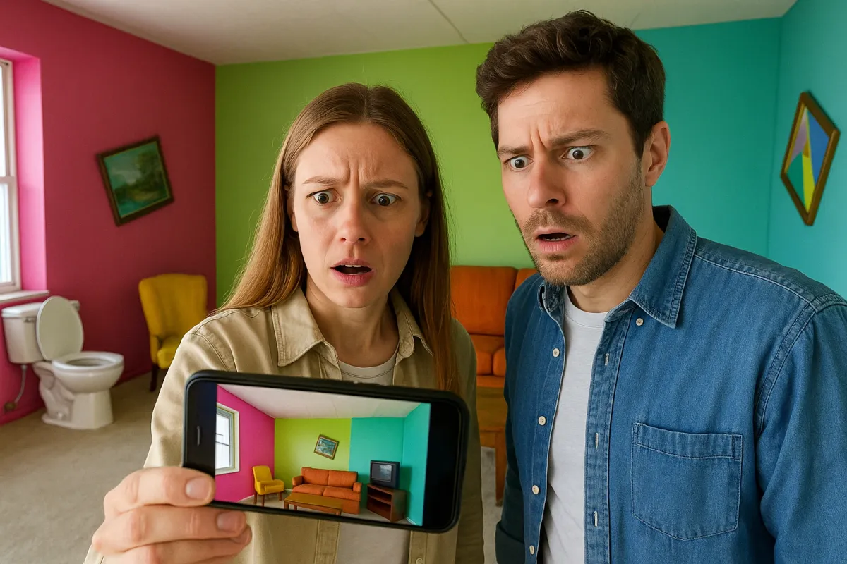
Real estate screenshots are trending again—and not in a good way. Bored Panda’s recent piece, “People Are Sharing Real Estate Listings From Hell, And Here Are The 25 Worst Ones” is blowing up socials, with users roasting nightmare layouts, cursed color choices, and photos that somehow make a 2,000 sq ft home feel like a broom closet. It’s hilarious… until you realize how many homes accidentally fall into the same traps, just on a quieter scale.
If you’re house-hunting, listing your place, or simply trying to make your home feel less chaotic and more “Pinterest saved,” these viral “don’ts” are the perfect crash course. Let’s flip the script and turn the internet’s worst listings into fresh, modern design moves you can actually use.
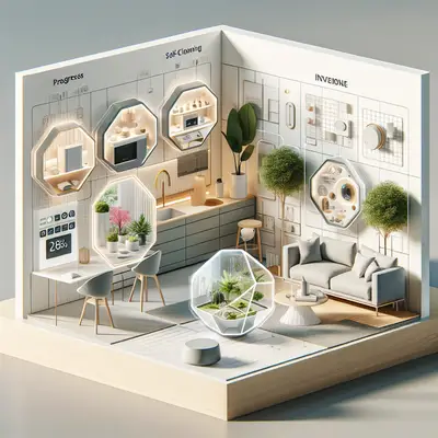
Below are five innovative home-living ideas inspired by what not to do—so your home never ends up as the next listing everyone’s sharing in the group chat.
1. From Chaos to Cohesion: Curate a “Story” for Every Room
One of the biggest crimes in those viral listings? Every room looked like it belonged to a different person, era, and planet. Neon walls next to heavy drapes, tile from the ’80s clashing with farmhouse signs from 2015—it’s visual whiplash.
Instead, think of each room as a chapter in the same story. Start with a simple palette: 2–3 main colors and 1–2 accent materials (like black metal + light oak, or brass + walnut). Repeat them throughout your home so your eye flows easily from space to space. This doesn’t mean everything has to match; it just means your spaces should talk to each other.
Small, impactful swaps—like using the same curtain style in multiple rooms, repeating a rug tone, or carrying one metal finish through your lighting—instantly remove that “listing from hell” randomness. The more intentional your visual rhythm, the more “styled” your home feels, even if nothing else changes.
2. Rethink “Open Space”: Design Zones, Not Just Empty Rooms
So many of those nightmare listings had massive, echoey spaces with furniture shoved against the walls, leaving a weird void in the center. Technically “spacious,” practically unusable.
Modern living is all about zones. Instead of treating an open-plan area like a single giant room, break it into mini-destinations: a reading corner by the window, a conversation area with a rug and two chairs, a dining zone defined by a pendant light. Use rugs, lighting, and furniture placement to create invisible boundaries.
Innovative twist: play with flexible zoning. Use lightweight accent chairs that can pivot between TV-watching and conversation, nesting side tables that move with you, and slim console tables that double as a work-from-home perch. This turns generic square footage into a home that actually supports how you live—hosting, lounging, working, unwinding—without the visual chaos that made those listing screenshots go viral for all the wrong reasons.
3. Lighting Like a Pro: Stop Letting the Overhead Do All the Work
One recurring theme in the “listings from hell”? Scary lighting. Harsh overhead bulbs, dim yellow corners, and random ceiling fans with tiny lights that do nothing but remind you the fan exists.
Layered lighting is one of the simplest upgrades modern homeowners can make—and it’s surprisingly affordable. Aim for three layers in most rooms:
- Ambient: your general room light (ceiling fixtures, flush mounts).
- Task: focused lighting where you actually do things (desk lamps, under-cabinet LEDs in the kitchen, bedside lamps).
- Accent: lights that create mood (picture lights, candles, lantern-style floor lamps, LED strips on shelves).
Innovative move: add smart bulbs or smart switches to at least one source in each room. Being able to change color temperature and brightness—from bright white for productivity to warm for evenings—instantly levels up your space. You’re not just lighting a room; you’re setting a scene. And that’s exactly what makes those perfectly lit listing photos on Zillow and Instagram feel so inviting… and what those viral “before” pics completely miss.
4. Function First: Design Like Someone Actually Lives There
The funniest (and most tragic) part of the bad listings? Bathtubs in the middle of bedrooms, toilets practically touching fridges, or closets you can’t open without hitting a bed. It’s meme-worthy—but it’s also a reminder: design has to work first.
Before you buy anything new, walk through your home like a guest. Are there clear paths, or do you sidestep furniture like an obstacle course? Can every door and drawer open fully? Is there a surface near the entry for keys and bags? Do you always drop your laptop in the same chair because there’s no real work surface?
Innovative idea: create micro-stations that match your routines. A coffee station with mugs, beans, and a small tray instead of a cluttered corner. A drop zone by the door with hooks, a bench, and a tray for mail. A vanity nook using a wall mirror and a console table instead of relying on the bathroom sink. These small, highly functional areas make your home feel intentional and luxurious—worlds apart from the “what were they thinking?” layouts that go viral.
5. Photo-Ready Living: Style Your Home Like It’s Always Being Listed (But For You)
Those “real estate listings from hell” are proof that photos don’t lie. Bad angles, clutter, bizarre décor choices—all brutally exposed in a single frame. But you can use that same lens to your advantage, even if you’re not selling.
Grab your phone and take wide shots of every room. Don’t stage—just capture how it actually looks. Then scroll through them like you’re browsing a listing. What jumps out in a bad way? A tangle of cords, a wall that feels too bare, a corner that looks oddly cramped? You’ll see things in photos that you’ve learned to ignore in real life.
Innovative twist: treat your home like your favorite creator treats their feed. Build a few “anchor moments”—areas that always look good on camera. A styled bookshelf with plants and art leaning casually. A nightstand with a lamp, a book, and a small dish. A sofa setup with a throw and two curated cushions instead of a pile of mismatched pillows. When a few zones are consistently photo-ready, the whole home starts to feel more elevated, even on your most lived-in days.
Conclusion
The internet is having a field day with disastrous real estate photos, and honestly, it’s deserved. But buried under the laughs is something surprisingly useful: a raw, unfiltered look at what happens when design is random instead of intentional.
You don’t need a full renovation to escape “listing from hell” energy. You just need cohesion instead of chaos, zones instead of empty space, layered lighting, functional layouts that match real life, and a photo-aware eye.
Your home doesn’t have to look like a showroom—but it also doesn’t need to be the next viral cautionary tale. Somewhere in between is that sweet spot: a space that feels modern, lived-in, and effortlessly stylish… the way good design should.
Key Takeaway
The most important thing to remember from this article is that this information can change how you think about Interior Design.